TRANSIT WAYFINDING SYSTEM
UX Research | Service Design
Project Overview
SageWay is a service design and wayfinding initiative reimagining public transit in Santa Fe through inclusive, culturally rooted visual systems. Grounded in local ecology and community insight, SageWay enhances rider navigation while fostering trust, beauty, and regional identity across transit experiences.
Problem Space
Santa Fe’s existing transit system lacked clarity, cultural resonance, and strong brand cohesion—creating barriers to adoption among both residents and visitors. This project asked: how might we transform the rider experience through research-informed service design and accessible, narrative-driven wayfinding?
Solution Highlights
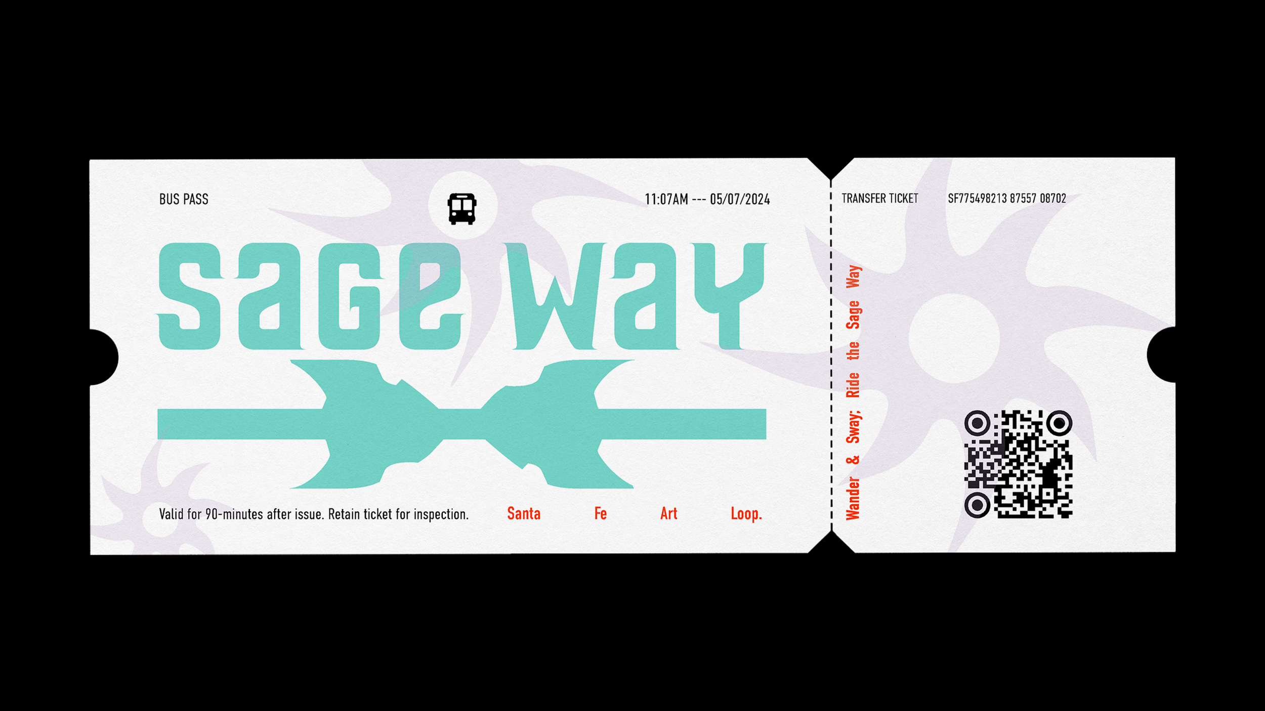
Brand & Service Integration: Positioned SageWay not just as a transit brand but as a navigational ethos—anchored in the metaphor of “the way of the sage”—to promote slow, intentional movement through city and self.
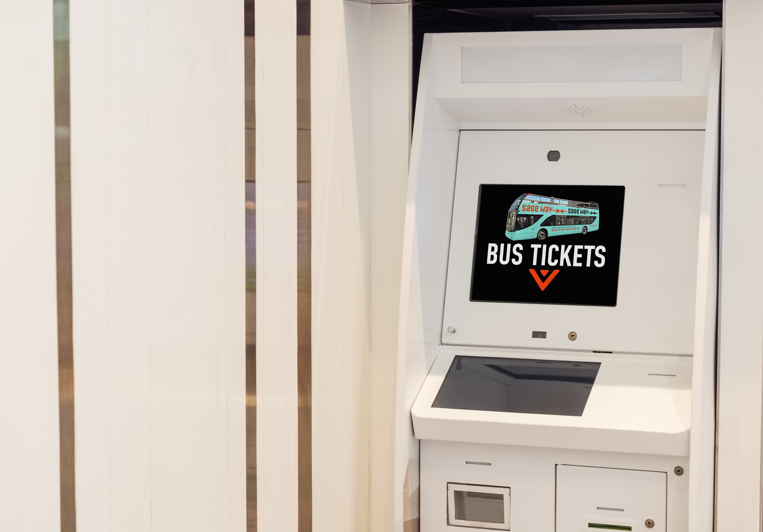
Wayfinding System: Designed legible, icon-driven signage and route identifiers rooted in desert flora, ensuring intuitive navigation across platforms and populations.
Inclusive Research-to-Visual Pipeline: Used cultural mapping and landscape audits to guide environmental graphics and information design that supports neurodiverse and multilingual users.
Research & Design Process
Conducted an environmental scan of regional transit systems, accessibility best practices, and public feedback on local rider needs.
Engaged in comparative UX benchmarking of transit and cultural mobility networks to identify symbolic and sensory design opportunities.
Translated findings into a scalable visual language, supported by a graphic standards manual, signage prototypes, and campaign assets for public rollout.
Outcomes & Impact
Repositioned public transit as an emotionally resonant, community-centered experience—enhancing engagement and reducing rider friction.
Elevated the system’s perceived value through a service design lens—uniting physical, digital, and social touchpoints under one cohesive experience.
Delivered a replicable model for how UX research and storytelling can shape civic infrastructure that is functional, beautiful, and deeply place-based.
Tools
Tools: Figma, Illustrator, InDesign, Wayfinding UX resources, Community & Cultural Research Templates